Mind the Jensen Gap!
Mind the Jensen Gap!
A post from my former PhD advisor Frank Nielsen popped up on my LinkedIn feed this morning mentionning the Jensen-Shannon divergence, and the convexity gap:
This convexity gap, the Jensen Gap, can have an (undesired) impact when you transform your features or target variables in a typical machine learning / data science pipeline.
When doing statistics or ML, we often normalize/standardize and apply other transformations on the original variables so that their distribution looks nicer and fits better the hypotheses required by the statistical tools (e.g. Gaussianization).
Let’s be a bit more concrete. Say you are trying to predict the fair price of goods sold on e-commerce platforms using regressions, i.e. essentially evaluating a conditional expectation.
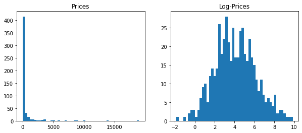
Prices are (usually) positive and heavily right-skewed (you can always find very very expensive goods). To help with regressions, it is common to apply a log-transform on prices. This log-transform makes the resulting transformed variable (log-prices) roughly Gaussian. One does ML operations (e.g. taking expectations) in the log-space, before transforming back with the inverse bijective transform: exp.
The Jensen inequality reads, for $f$ convex:
That is, the Jensen Gap is $\mathbb{E}[f(Y)] - f(\mathbb{E}[Y]) \geq 0$.
Now, back to our toy-example, considering $Y$ the random variable for prices,
we have:
That is,
which means we would underestimate the real quantity.
We can illustrate that numerically. Let’s consider $Y \sim \text{ Lognormal}(\mu, \sigma^2)$. We know that $\mathbb{E}[Y] = \exp(\mu + \frac{1}{2}\sigma^2)$.
import numpy as np
import pandas as pd
import matplotlib.pyplot as plt
%matplotlib inline
mu = 4
sigma = 2
size = 500
prices = pd.Series(np.random.lognormal(mu, sigma, size=size))
plt.figure(figsize=(10, 4))
plt.subplot(1, 2, 1)
plt.hist(prices, bins=50)
plt.title('Prices')
plt.subplot(1, 2, 2)
plt.hist(np.log(prices), bins=50)
plt.title('Log-Prices')
plt.show()
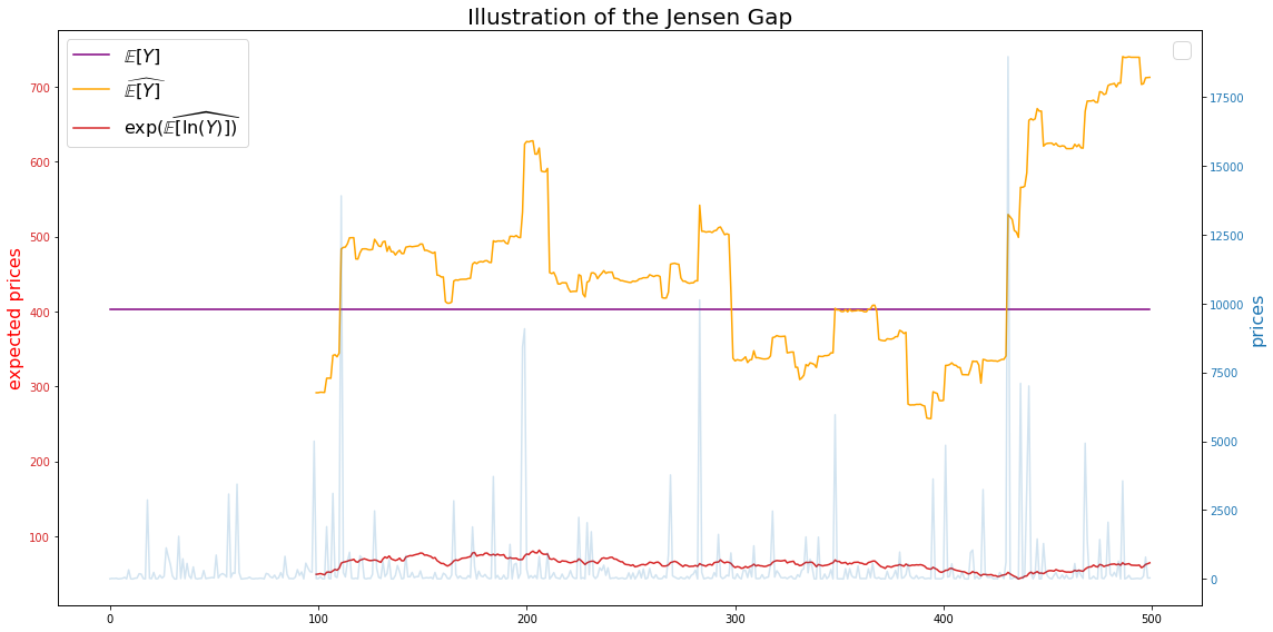
Let’s now compare the true mean, the estimated mean, and the estimated mean in the log-space converted back to the original space:
window = 100
fig, ax1 = plt.subplots(figsize=(16, 8))
color = 'tab:red'
ax1.set_ylabel('expected prices', color='red', fontsize=16)
ax1.plot(pd.Series([np.exp(mu + sigma**2 / 2)] * size),
         label=r'$\mathbb{E}[Y]$', color='purple')
ax1.plot(prices.rolling(window).mean(),
         label=r'$\widehat{\mathbb{E}[Y]}$', color='orange')
ax1.plot(np.exp(np.log(prices).rolling(window).mean()),
         label=r'$\exp(\widehat{\mathbb{E}[\ln(Y)]})$', color=color)
ax1.tick_params(axis='y', labelcolor=color)
ax1.legend(fontsize=16)

ax2 = ax1.twinx()
color = 'tab:blue'
ax2.set_ylabel('prices', color=color, fontsize=16)
ax2.plot(prices, alpha=0.2, color=color)
ax2.tick_params(axis='y', labelcolor=color)
plt.title('Illustration of the Jensen Gap', fontsize=20)
plt.legend(fontsize=20)
fig.tight_layout()
plt.show()
True mean:
np.exp(mu + sigma**2 / 2)
403.4287934927351
Estimated mean (full sample):
np.mean(prices)
449.2386823126975
Estimated mean obtained after log-transform (full sample) and converted back with exp-transform:
np.exp(np.mean(np.log(prices)))
59.185451725779366
Question: Is it possible to have an idea of the expected gap in order to debias quantities?
In this particular example, we can notice that the gap is a function of $(\mu, \sigma)$; It seems that the larger $\mu$ or $\sigma$, the larger the gap.
Conclusion: Mind the gap!