[Correlation] How to visualize dependence between two variables?
In this blog, we provide a snippet of code to explore the dependence between two variables. We illustrate its use on visualizing the dependence between a few of the main cryptocurrencies: Bitcoin (BTC), Litecoin (LTC), Ether (ETH) and Ripple (XRP).
Basically, linear correlation (Pearson estimator) is brittle and in many situations irrelevant, e.g. in case of outliers, tail-variations, tail-dependence, etc. Linear correlation is mostly suited when the underlying distribution is jointly Gaussian. Even in the case where the dependence is Gaussian (Gaussian copula), but the margins are taily (e.g., a Student’s t-distribution with a low degree of freedom), the (Pearson) linear correlation estimator can severly underestimate the underlying linear correlation existing between these variables.
The function visualize dependence takes as input the observations for two variables, and builds its empirical copula (distribution capturing all the dependence between these two variables). It displays the empirical copula alongside the copula for independence (on its left) and the Gaussian copula (on its right) with correlation the one estimated between the two variables. Thus, we can see how far the empirical distribution for dependence is from the independence and the Gaussian one.
For financial variables, they may exhibit stronger tail-dependence. That is, during crashes, they have a high chance to move together, in the same direction, with an intensity much higher than usual. This scenario is in fact excluded by the Gaussian copula which gives it a 0 probability of happening.
%load_ext autoreload
%autoreload 2

import numpy as np
import pandas as pd
from scipy.stats import rankdata, norm
import matplotlib.pyplot as plt

from crycompare import History

%matplotlib inline
def generate_sample_from_biv_gaussian_copula(rho, size):
    """
        Returns a sample from a bivariate Gaussian copula of correlation rho.

        :param rho: the correlation parameter
        :param size: the size of the sample

        :return: a (size, 2) numpy array of samples
    """
    mv_normal = np.random.multivariate_normal([0,0], [[1,rho],[rho,1]], size)
    samples = norm.cdf(mv_normal)

    return samples
def visualize_dependence(X,Y):
    """
        Displays three copulas:
            - left: the independence copula
            - center: the empirical copula of (X,Y)
            - right: the Gaussian copula of correlation rho(X,Y)

        X and Y must have the same index and no NAs.

        :param X: a pandas series
        :param Y: a pandas series

        :return: nothing, but displays the independence, empirical and Gaussian copula of correlation rho(X,Y)
    """
    # build the empirical copula
    rk1 = rankdata(X,method='ordinal')
    rk2 = rankdata(Y,method='ordinal')
    nb_bins = 25
    histo2d, xedges, yedges = np.histogram2d(rk1,rk2,bins=nb_bins)
    freq_histo2d = histo2d / len(rk1)

    # build the independence copula
    unif = np.ones((nb_bins,nb_bins)) / len(rk1)

    # build the Gaussian copula of correlation rho(X,Y)
    rho = np.corrcoef(X,Y)[0,1]
    samples = generate_sample_from_biv_gaussian_copula(rho, len(rk1))
    gcop_hist2d, xedges, yedges = np.histogram2d(samples[:,0], samples[:,1], bins=nb_bins)
    freq_gcop2d = gcop_hist2d / len(rk1)


    min_cops = min(freq_histo2d.min(), unif.min(), freq_gcop2d.min())
    max_cops = max(freq_histo2d.max(), unif.max(), freq_gcop2d.max())


    # display the distributions
    plt.figure(figsize=(20,8))

    plt.suptitle('Dependence: '+X.name+' vs. '+Y.name, fontsize=24)

    ax = plt.subplot(1,3,1)
    cax = ax.pcolormesh(unif, vmin=min_cops, vmax=max_cops)
    cbar = plt.colorbar(cax,orientation='horizontal')
    ax.xaxis.set_ticklabels(np.linspace(0,1,6))
    ax.yaxis.set_ticklabels(np.linspace(0,1,6))

    ax = plt.subplot(1,3,2)
    cax = ax.pcolormesh(freq_histo2d, vmin=min_cops, vmax=max_cops)
    cbar = plt.colorbar(cax,orientation='horizontal')
    ax.xaxis.set_ticklabels(np.linspace(0,1,6))
    ax.yaxis.set_ticklabels(np.linspace(0,1,6))

    ax = plt.subplot(1,3,3)
    cax = ax.pcolormesh(freq_gcop2d, vmin=min_cops, vmax=max_cops)
    cbar = plt.colorbar(cax,orientation='horizontal')
    ax.xaxis.set_ticklabels(np.linspace(0,1,6))
    ax.yaxis.set_ticklabels(np.linspace(0,1,6))

    plt.show()

    print("Estimated linear correlation between "+X.name+" and "+Y.name+": ",round(rho,2))
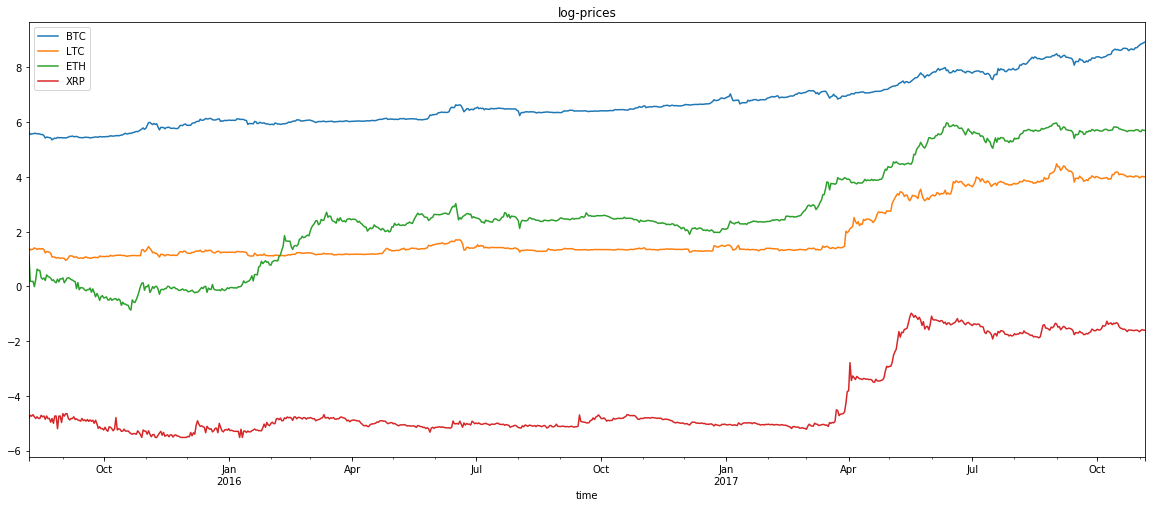
coins = ['BTC','LTC','ETH','XRP']
h = History()
df_dict = {}
for coin in coins:
histo = h.histoDay(coin,'USD',allData=True)
if histo['Data']:
df_histo = pd.DataFrame(histo['Data'])
df_histo['time'] = pd.to_datetime(df_histo['time'],unit='s')
df_histo.index = df_histo['time']
del df_histo['time']
del df_histo['volumefrom']
del df_histo['volumeto']
df_dict[coin] = df_histo
historical = pd.concat([df_dict[coin]['close'] for coin in coins] ,axis=1).dropna()
historical.columns = coins
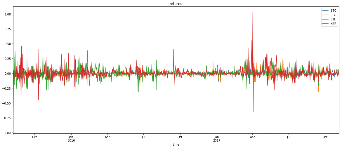
returns = np.log(historical).diff(1).dropna()
np.log(historical).plot(title='log-prices',figsize=(20,8))
returns.plot(title='returns',figsize=(20,8))
<matplotlib.axes._subplots.AxesSubplot at 0x7f0f7a30e9b0>
for i in range(len(coins)):
    for j in range(len(coins)):
        if j > i:
            visualize_dependence(returns[coins[i]],returns[coins[j]])
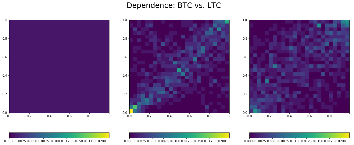
Estimated linear correlation between BTC and LTC: 0.53

Estimated linear correlation between BTC and ETH: 0.27
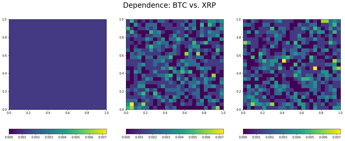
Estimated linear correlation between BTC and XRP: 0.08
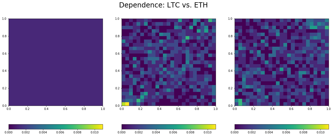
Estimated linear correlation between LTC and ETH: 0.2
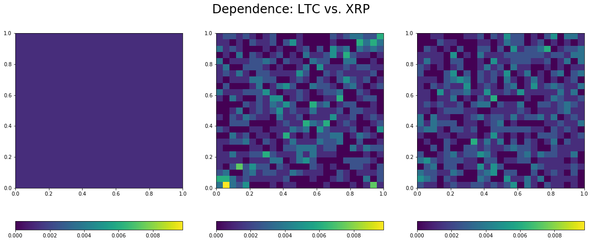
Estimated linear correlation between LTC and XRP: 0.14
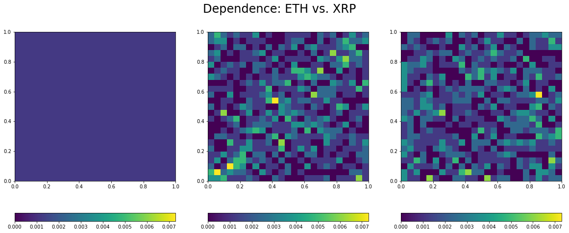
Estimated linear correlation between ETH and XRP: 0.03
Remarks:
- Overall low correlation between these coins, but for the BTC/USD and LTC/USD pair.
With many others, they may constitute a diversified portfolio, but for their
- Lower-tail dependence between all the pairs, which means that they tend to crash together.