Some further assessment of the original CorrGAN model (2019)
Some further assessment of the original CorrGAN model (2019)
Several students from ESILV, an engineering school in Paris, took upon the task of studying, and developing new models of financial correlations based on Generative Adversarial Networks (GANs). Their work will be based on my seminal work on the topic (CorrGAN, 2019). However, my work was quite preliminary, and there is much left to explore and understand.
The first step for them was to get familiar with GANs and correlation matrices, so that they could reproduce the methodology and results described in the paper.
Then, they extended the empirical assessment of the model which is described in this blog post, the first of a series summarizing their research work.
TL;DR CorrGAN can indeed capture many properties of real empirical financial correlation matrices; However, out of the box, it does not seem capable of covering the support of the empirical distribution, thus missing possible scenarios. More work on the model needed…
NB The students are looking for interesting summer internships. If you think they could be a match, feel free to contact them directly to discuss opportunities within the space of data science / machine learning / fintech:
- Victor Goubet
- Chloé Daems
- Quentin Bourgue
- Davide Coldebella
- Riccardo Rossetto
- Mahdieh Aminian
- Marco Menotti
import pandas as pd
import numpy as np
from sklearn.decomposition import PCA
from sklearn.preprocessing import StandardScaler
import ot
import matplotlib.pyplot as plt

%matplotlib inline
Some features which are extracted from the correlation matrices (cf. this blog post):
selected_cols = [
 'coeffs_1%',
 'coeffs_10%',
 'coeffs_25%',
 'coeffs_50%',
 'coeffs_75%',
 'coeffs_90%',
 'coeffs_99%',
 'coeffs_max',
 'coeffs_mean',
 'coeffs_min',
 'coeffs_std',
 'condition_number',
 'coph_corr_average',
 'coph_corr_complete',
 'coph_corr_single',
 'coph_corr_ward',
 'determinant',
 'mst_avg_shortest',
 'mst_centrality_25%',
 'mst_centrality_50%',
 'mst_centrality_75%',
 'mst_centrality_max',
 'mst_centrality_mean',
 'mst_centrality_min',
 'mst_centrality_std',
 'pf_25%',
 'pf_50%',
 'pf_75%',
 'pf_max',
 'pf_mean',
 'pf_min',
 'pf_std',
 'varex_eig1',
 'varex_eig_MP',
 'varex_eig_top30',
 'varex_eig_top5']
These features can be useful to describe the correlation matrices. Their choice is somewhat arbitrary and guided by intuition and experience. More time and thoughts could be dedidated to extract other potentially more relevant features.
They are used below as the input space for a PCA projection. In that case, they are chosen so that they encode a wide variety of known characteristics about the correlation matrices, as diverse as possible.
But, they can also be useful to try to understand if some experiment results (e.g. from Monte Carlo simulations) are driven by such or such characteristics of the correlation matrix (through a regression of the simulations results on the features). In that case, they can be chosen so that they encode our hypotheses.
2D PCA projections of the ‘real’ empirical correlation matrices
We can see below that despite the students independently built their training datasets of ‘real’ $80 \times 80$ empirical correlation matrices, the projected empirical distributions are quite similar.
More precisely, from the same file containing S&P 500 stocks returns over the past 20 years (which was also used to train the CorrGAN model), the students estimated 2000 correlation matrices, choosing for each one 80 random stocks (out of approximately 500), and using a random window of 252 consecutive trading days.
We can expect that their training datasets are quite diverse.
Then, features are extracted from these correlation matrices (cf. this blog), and the matrices (represented by their features) are projected from the features space to the 2D (PC1, PC2) space. These projections are illustrated in the scatter plots below (one for each student (dataset)).
students = ['Victor', 'Chloe', 'Quentin', 'Thomas',
            'Riccardo', 'Mahdieh', 'Marco', 'Davide']
colors = ['orange', 'blue', 'green', 'purple',
          'pink', 'yellow', 'cyan', 'red']
data = []
tdata = 'real'
for student in students:
    features = pd.read_hdf('{}_{}_features.h5'.format(student, tdata))
    data.append(features[selected_cols].astype(float))
X = pd.concat(data, axis=0)

scaler = StandardScaler()
projected_features = (PCA(n_components=2)
                      .fit_transform(scaler.fit_transform(X)))

plt.figure(figsize=(16, 16))
for batch, student in enumerate(students):
    plt.subplot(4, 2, batch + 1)
    plt.scatter(projected_features[batch*2000:(batch+1)*2000, 0],
                projected_features[batch*2000:(batch+1)*2000, 1],
                color=colors[batch],
                label='{} - {}'.format(tdata, student),
                alpha=0.4)
    plt.legend()
    plt.xlabel('PC1')
    plt.ylabel('PC2')
plt.show()

plt.figure(figsize=(8, 8))
for batch, student in enumerate(students):
    plt.scatter(projected_features[batch*2000:(batch+1)*2000, 0],
                projected_features[batch*2000:(batch+1)*2000, 1],
                color=colors[batch],
                label='{} - {}'.format(tdata, student),
                alpha=0.4)
plt.legend()
plt.xlabel('PC1')
plt.ylabel('PC2')
plt.show()
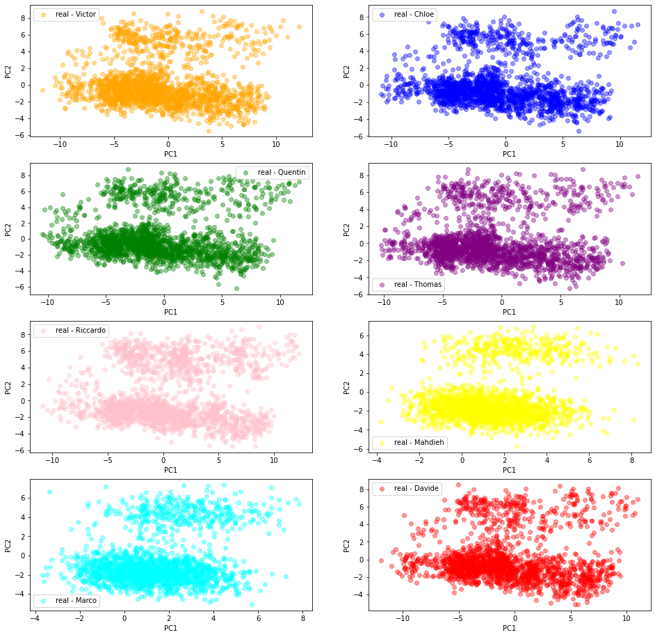
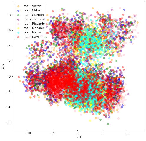
In the last scatter plot, we see that the projections are quite similar (except for Marco and Mahdieh to some extent) hinting at the similarity of the original datasets distributions. This is good news: There is one underlying ‘true’ distribution that we aim at capturing.
Let’s look at it a bit more closely by projecting jointly the datasets of two students at a time:
def compute_ot_distance(d1, d2):
    d1_measure, d2_measure = (
        np.ones((len(d1),)) / len(d1),
        np.ones((len(d2),)) / len(d2),)
    gdist = ot.dist(d1, d2)
    ot_mat = ot.emd(d1_measure, d2_measure, gdist)

    return np.trace(np.dot(np.transpose(ot_mat), gdist))
plt.figure(figsize=(16, 60))
dist_mat = np.zeros((len(students), len(students)))
idx = 1
for batch1, student1 in enumerate(students):
    for batch2, student2 in enumerate(students):
        if batch2 > batch1:
            data = []
            features = pd.read_hdf('{}_{}_features.h5'.format(student1, 'real'))
            data.append(features[selected_cols].astype(float))
            features = pd.read_hdf('{}_{}_features.h5'.format(student2, 'real'))
            data.append(features[selected_cols].astype(float))
            X = pd.concat(data, axis=0)

            scaler = StandardScaler()
            pfeatures = (PCA(n_components=2)
                         .fit_transform(scaler.fit_transform(X)))


            ot_dist = compute_ot_distance(pfeatures[:2000, :],
                                          pfeatures[2000:4000, :])

            dist_mat[batch1, batch2] = ot_dist
            dist_mat[batch2, batch1] = ot_dist

            plt.subplot(10, 3, idx)
            plt.scatter(pfeatures[:2000, 0], pfeatures[:2000, 1],
                        label='{} - {}'.format('real', student1),
                        color='blue')
            plt.scatter(pfeatures[2000:4000, 0], pfeatures[2000:4000, 1],
                        label='{} - {}'.format('real', student2),
                        color='orange')
            plt.legend()
            plt.xlabel('PC1')
            plt.ylabel('PC2')
            plt.title("Wasserstein dist: {}".format(
                round(ot_dist, 2)))
            idx += 1
plt.show()
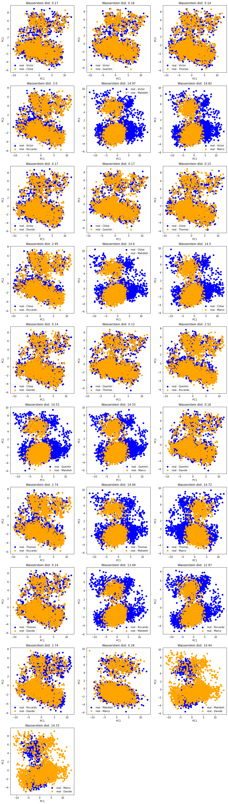
And the matrix of pairwise (Wasserstein) distances between the students’ empirical distributions:
plt.figure(figsize=(8, 6))
plt.pcolormesh(dist_mat)
plt.colorbar()
plt.xticks(range(len(students)), students, rotation=90)
plt.yticks(range(len(students)), students, rotation=0)
plt.title('Pairwise distances between the empirical distributions')
plt.show()
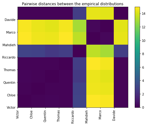
In all these plots, we observe there is (at least) a second salient mode in the distributions.
Question: To what kind of correlation matrices does the second mode correspond to? Can we characterize them in terms of features (let’s do a binary classification + SHAP analysis)? in terms of associated market performance?
2D PCA projections of the ‘gan’ generated correlation matrices
In this section, we are using the GAN generated correlation matrices.
Each student trained his/her own model following the paper CorrGAN: Sampling Realistic Financial Correlation Matrices Using Generative Adversarial Networks.
From their own flavour of the GAN model (different training set, different selection of hyperparameters, different training time), they sampled 2000 ‘gan’ correlation matrices which are projected in a 2D PCA space following the same methodology as described above.
students = ['Victor', 'Chloe', 'Quentin', 'Thomas',
            'Riccardo', 'Mahdieh', 'Marco', 'Davide']
colors = ['orange', 'blue', 'green', 'purple',
          'pink', 'yellow', 'cyan', 'red']
data = []
tdata = 'gan'
for student in students:
    features = pd.read_hdf('{}_{}_features.h5'.format(student, tdata))
    data.append(features[selected_cols].astype(float))
X = pd.concat(data, axis=0)

scaler = StandardScaler()
pfeatures = (PCA(n_components=2)
             .fit_transform(scaler.fit_transform(X)))
pfeatures = pd.DataFrame(pfeatures)
pfeatures[2] = np.nan
for idx, student in enumerate(students):
    pfeatures.loc[idx*2000:(idx+1)*2000, 2] = idx

plt.figure(figsize=(16, 16))
for batch, student in enumerate(students):
    points = pfeatures[pfeatures[2] == batch].values
    plt.subplot(4, 2, batch + 1)
    plt.scatter(points[:, 0],
                points[:, 1],
                c=colors[batch],
                alpha=0.4,
                label='{} - {}'.format(tdata, student))
    plt.legend()
    plt.xlabel('PC1')
    plt.ylabel('PC2')
plt.show()

plt.figure(figsize=(10, 10))
for batch, student in enumerate(students):
    points = pfeatures[pfeatures[2] == batch].values
    plt.scatter(points[:, 0],
                points[:, 1],
                c=colors[batch],
                alpha=0.4,
                label='{} - {}'.format(tdata, student))
plt.legend()
plt.xlabel('PC1')
plt.ylabel('PC2')
plt.show()
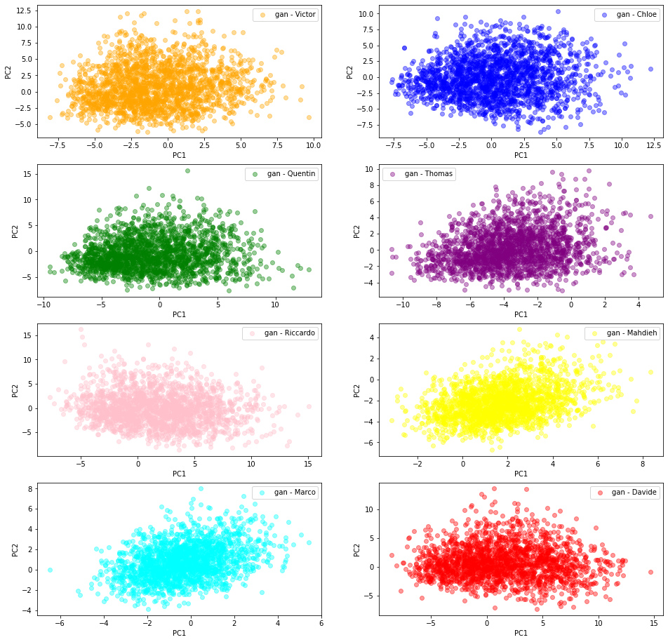
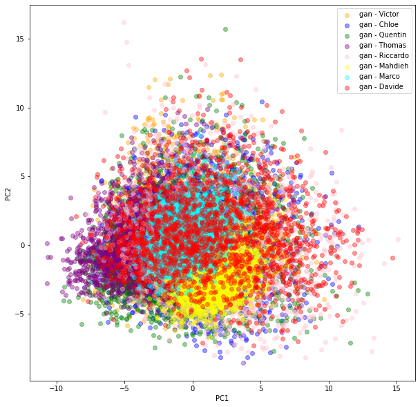
We can see there is more variability in the distributions obtained by the students from their GAN. Also, the (projections) distributions do not seem to have the same shape as the ‘real’ original ones: It seems the ‘gan’ distributions are unimodal whereas the ‘real’ ones are clearly not.
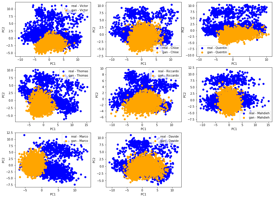
[Qualitative assessment] 2D PCA ‘real’ vs. ‘gan’ distributions
Let’s compare for each student their ‘real’ and ‘gan’ distributions. With an accurate GAN model and a successful training, these two distributions should match nearly perfectly.
plt.figure(figsize=(16, 16))
for batch, student in enumerate(students):
    data = []
    for tdata in ['real', 'gan']:
        features = pd.read_hdf('{}_{}_features.h5'.format(student, tdata))
        data.append(features[selected_cols].astype(float))
    X = pd.concat(data, axis=0)
    scaler = StandardScaler()
    pfeatures = (PCA(n_components=2)
                 .fit_transform(scaler.fit_transform(X)))

    plt.subplot(4, 3, batch + 1)
    plt.scatter(pfeatures[:2000, 0], pfeatures[:2000, 1],
                label='{} - {}'.format('real', student),
                color='blue')
    plt.scatter(pfeatures[2000:4000, 0], pfeatures[2000:4000, 1],
                label='{} - {}'.format('gan', student),
                color='orange')
    plt.legend()
    plt.xlabel('PC1')
    plt.ylabel('PC2')
plt.show()
This is not the case. However, we notice a strong overlap (of the support) between the two distributions, and also some variability in the results obtained. This is not unexpected knowing how hard and unstable it is to train a GAN.
Question: GAN-generated matrices have been post-processed with a Higham projection whereas empirical ones were not. Does it explain part of the difference?
[Quantitative assessment] Ranking of the models based on 2D optimal transport between ‘real’ and ‘gan’ distributions
Each ‘dirac’ in the (PC1, PC2) space corresponds to a correlation matrix projected via the PCA of its extracted features. We jointly applied the PCA on the features extracted from ‘real’ correlation matrices and the features extracted from the ‘gan’ generated correlation matrices, and obtained a distribution of ‘diracs’ (in the 2D space (PC1, PC2) of projection). Ideally, these two distributions would match closely. We saw qualitatively on the above scatter plots that unfortunately it is not the case. Let’s find out which ones match more closely (not necessarily obvious to the eye, as we cannot really see the density on these plots).
We can do that using a metric between (empirical) distributions: The Wasserstein distance.
results = []
for batch, student in enumerate(students):
    data = []
    for tdata in ['real', 'gan']:
        features = pd.read_hdf('{}_{}_features.h5'.format(student, tdata))
        data.append(features[selected_cols].astype(float))
    X = pd.concat(data, axis=0)
    scaler = StandardScaler()
    pfeatures = (PCA(n_components=2)
                 .fit_transform(scaler.fit_transform(X)))

    real = pfeatures[:2000, :]
    gan = pfeatures[2000:4000, :]

    ot_dist = compute_ot_distance(real, gan)

    results.append([student, ot_dist])

pd.Series([d for s, d in results],
          index=[s for s, d in results]).sort_values()
Davide       8.113906
Chloe       12.794045
Mahdieh     13.170089
Riccardo    13.948011
Quentin     21.748937
Victor      22.565277
Thomas      26.318185
Marco       31.670610
dtype: float64
NB This ranking is not an assessment of the students’ work quality, but rather a criticism of the model instability.
Question: Would we obtain the same ranking if we were to apply the optimal transport in the original feature space (36D)? and on the correlation matrices directly (3160D)?
Conclusion: The CorrGAN model needs to be improved…
We noticed before, in several occasions, that CorrGAN is able to recover the well-known stylized facts, in other words: CorrGAN generated matrices are realistic. But, we did not know whether the generated samples spanned the whole distribution. We have an answer now: It doesn’t; at least, not straight out-of-the-box.
All students were able to reproduce the stylized facts easily, and actually sometimes better than my own experiments, but as we saw in this blog post none of them were able to closely match the original empirical distribution (proxied by PCA of extracted features…).
The students are now working on several extensions of the model (conditional generation, covariances, applications). Conditional generation might help for capturing the various modes better. We shall see.